HOME / Posts Tagged: web design
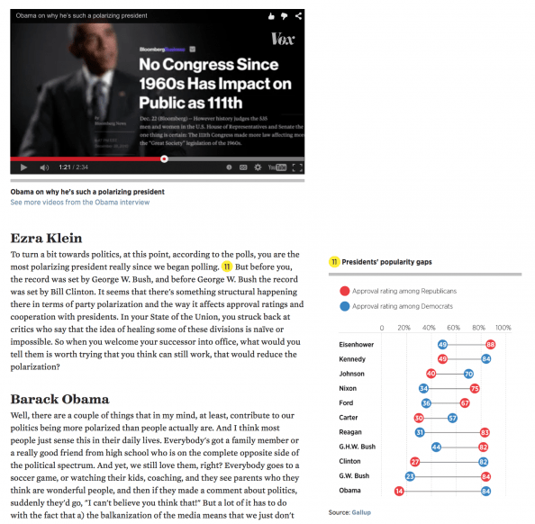
VOX: Editorial design for a digital world
Here is a great example from VOX on what it’s like doing an interview for a digital world, in a way that no other medium can achieve. The basic idea? The full text of the interview is accompanied by charts, links and annotations providing more depth on the answers. But that’s just the half of [Continue reading]
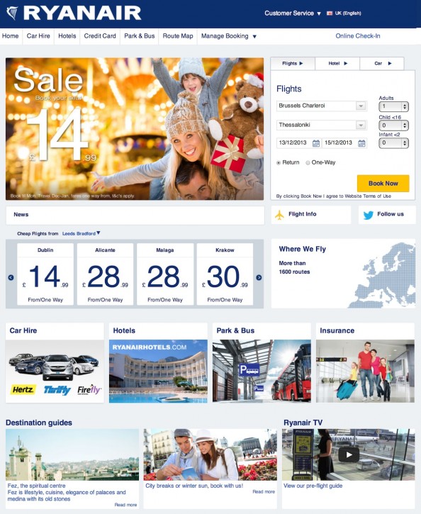
It’s the end of an era for web design
Ryanair has redesigned it’s website. Before it looked like it was designed in 1992 (because it probably was). Now it looks like someone paid 15$ for a template. But even that is an improvement. You don’t have to prove you are a human in order to get a ticket for starters. I guess the lousy [Continue reading]
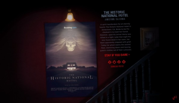
Parallax for the right reasons
I’m not a big fan of parallax web sites, mainly because it’s being overused without much point and it is usually not well implemented, resulting in slow-loading websites. Once in a while though, you get a website where the parallax effect is actually part of the concept of the website. Booking.com has an excellent new [Continue reading]
Blog Redesign, Part II
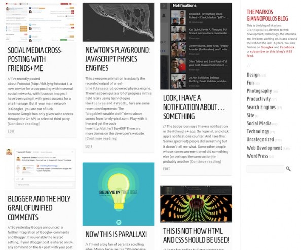
// I’ve been refining the redesign of this blog (see previous post about it for a screenshot of how it looked in the past) and here is the summary of recent changes: All pages: Full page width! Home page: – More space between boxes – Very very white background on boxes instead of gray – [Continue reading]
Characteristics of a modern portfolio site
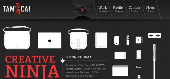
An extensive and excellent collection of portfolio sites, mainly for designers and developers. Still, food for inspiration… Of all of the types of websites, the portfolio site has to overcome what might be some of the most difficult hurdles. Talk to almost any designer and they will agree, launching your own portfolio site is a [Continue reading]
Designing UX Exchange
An excellent case study of designing for the Web. Most often web designs start with a let’s-make-something-pretty concept instead of first realizing what is the content, the desired features and which are the user actions we want to “provoke”, and the developing a design to accommodate these elements. UX Exchange is a Q&A site in [Continue reading]
Redesigning TechCrunch: We Picked This Logo Just to Piss You Off
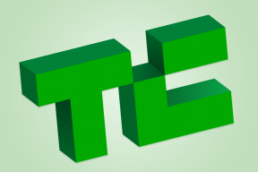
Not sure what to think on the TechCrunch re-design yet, but it certainly loads faster (I had stopped visiting the last few months due to it’s slowness) The new logo is our most controversial change. I love it, though that’s no accident: we went through many, many options with Code & Theory before finding one [Continue reading]
25 Examples of Inspiring Product Display in Web Design
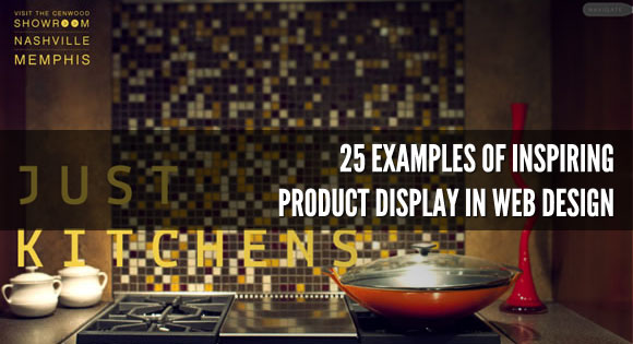
Choosing the best way to display products is a really important step of web design, since the way you display your products can drive attention to it and make users interested in what you are selling, or can drive users away. It’s like when you are walking in a mall, the most creative, elegant or [Continue reading]
