HOME / Posts Tagged: redesign
Blog Redesign, Part II
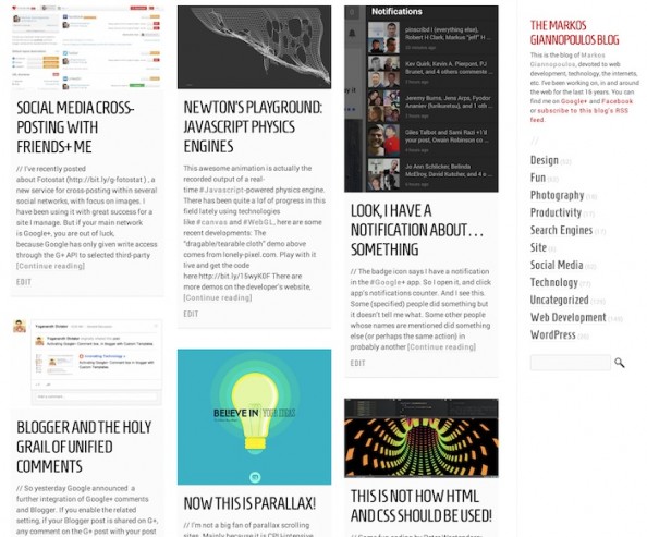
// I’ve been refining the redesign of this blog (see previous post about it for a screenshot of how it looked in the past) and here is the summary of recent changes: All pages: Full page width! Home page: – More space between boxes – Very very white background on boxes instead of gray – [Continue reading]
Redesigning TechCrunch: We Picked This Logo Just to Piss You Off
Not sure what to think on the TechCrunch re-design yet, but it certainly loads faster (I had stopped visiting the last few months due to it’s slowness) The new logo is our most controversial change. I love it, though that’s no accident: we went through many, many options with Code & Theory before finding one [Continue reading]

