HOME / Posts Tagged: infographics
Data visualisation porn
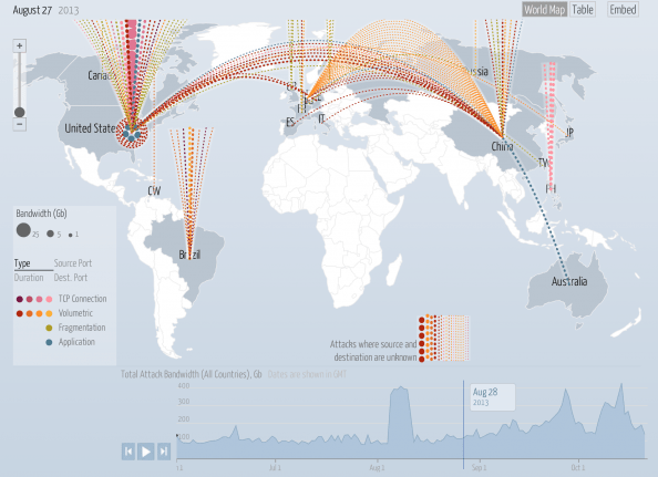
The Digital Attack Map is a live data visualization, built through a collaboration between Arbor Networks and Google Ideas, that maps “distributed denial of service” (DDoS attacks) designed to take down websites around the globe. Many websites face targeted digital attacks by people who aim to silence their speech. This tool and visualization specifically surfaces [Continue reading]

How to create an infographic from your Google Analytics data
// Well, there’s not much to say here. People love #infographics for visualising information and numbers in an easy to consume manner. People also love #GoogleAnalytics for an endless amount of #statisticsabout their website.Now you can combine both with a few clicks on the free tool by Visual.ly. The process is relatively simple, you connect [Continue reading]

Colours, Emotions, Brands
// This kind of chart has been going around the net for a while, but a reminder is always good :) If you’re looking for more #marketing -oriented #color #infographics see also How do colors affect purchases?http://bit.ly/VG6O70 (Chart by The Logo Company http://bit.ly/VG6wwT)