Storytelling with Data is a popular data visualisation blog by Cole Nussbaumer Knaflic. Every month Cole sets up a challenge for her readers. This month, the theme is “Emulate!”, inspired by the book Steal Like An Artist: 10 Things No One Told You About Being Creative by Austin Kleon.
The idea is to recreate a data visualisation that we found interesting or tought us something. For my submission, I used the distribution plot from the Eurostat Region and Cities Illustrated (RCI) tool.
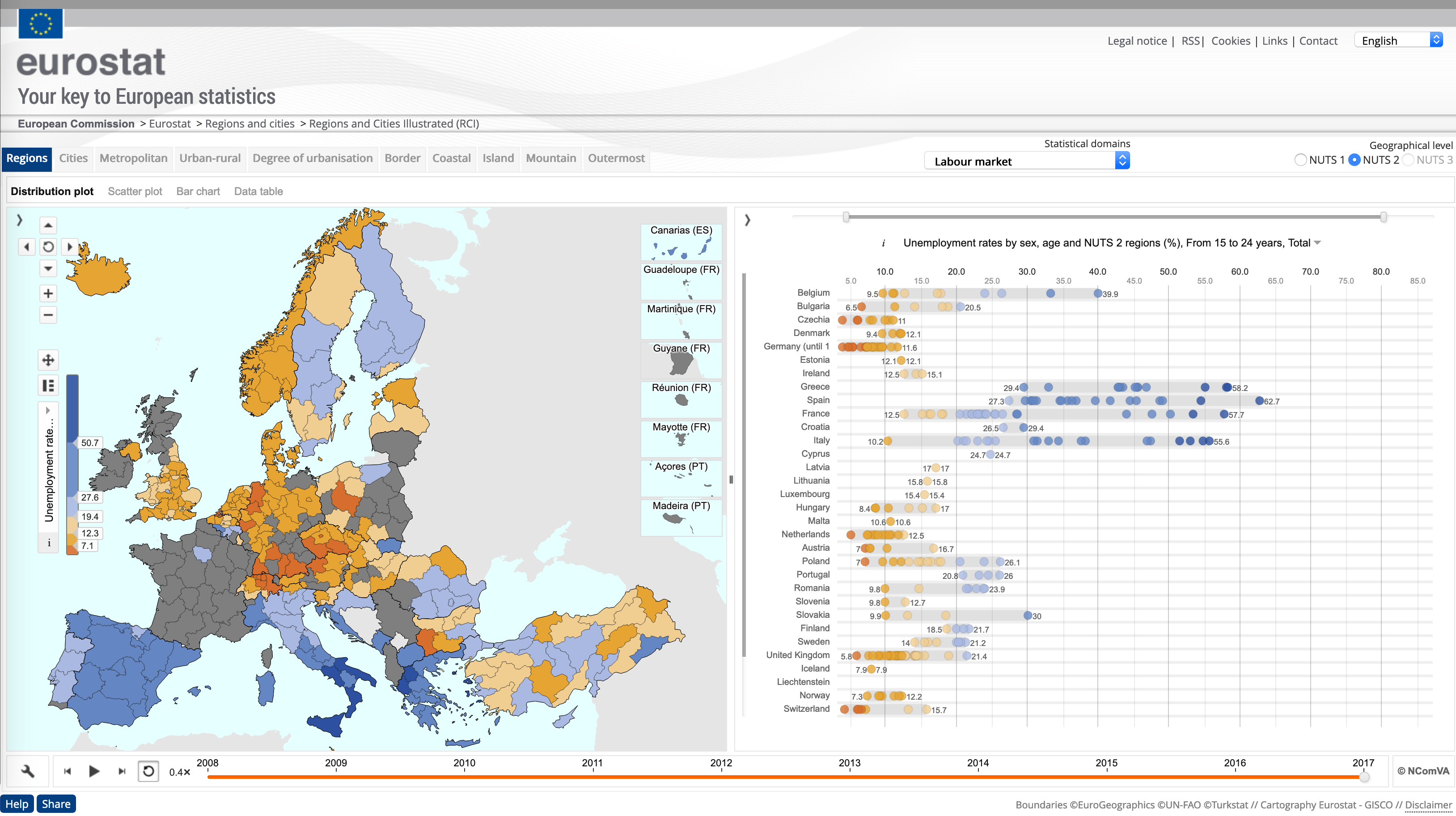
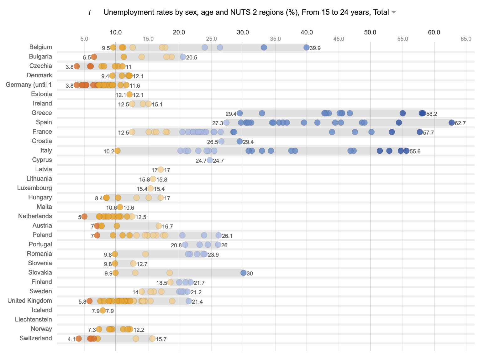
Regions and Cities Illustrated by Eurostat
RCI is a tool that provides access to multiple datasets on regional data across various themes and typologies. The tool is based on software by Swedish company NComVA (now part of QlikTech). RCI offers several types of visualisation. One of them is a distribution plot (can also be described as a bubble chart), showing data of regions grouped by country.
Regions and Cities Illustrated by Eurostat
The interesting twist of the implementation is that it includes a range chart in the form of a background gray “shadow” under the bubbles showing the minimum/maximum values of each country.
Using the same dataset from Eurostat, my attempt was implemented using HighCharts. For the circles/bubbles I used the “bubble” type and took advantage of HighCharts ability to combine chart types. So the “shadow” is done with a second “xrange” type graph. The end result is below, served via JSFiddle. One interesting outcome of HighCharts’s chart combination feature is that hovering over the “shadows” will focus the chart to the range bar, hiding the bubbles. This allows exploring the data in two ways.
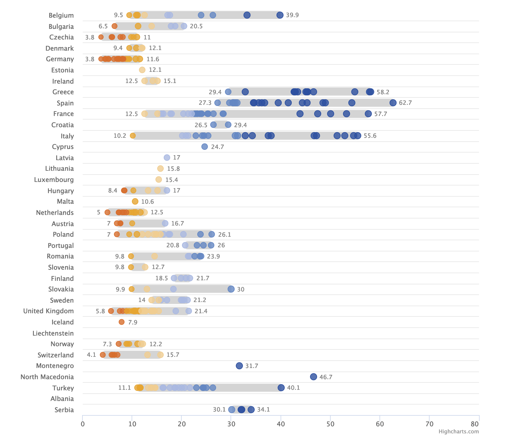
Bubble view
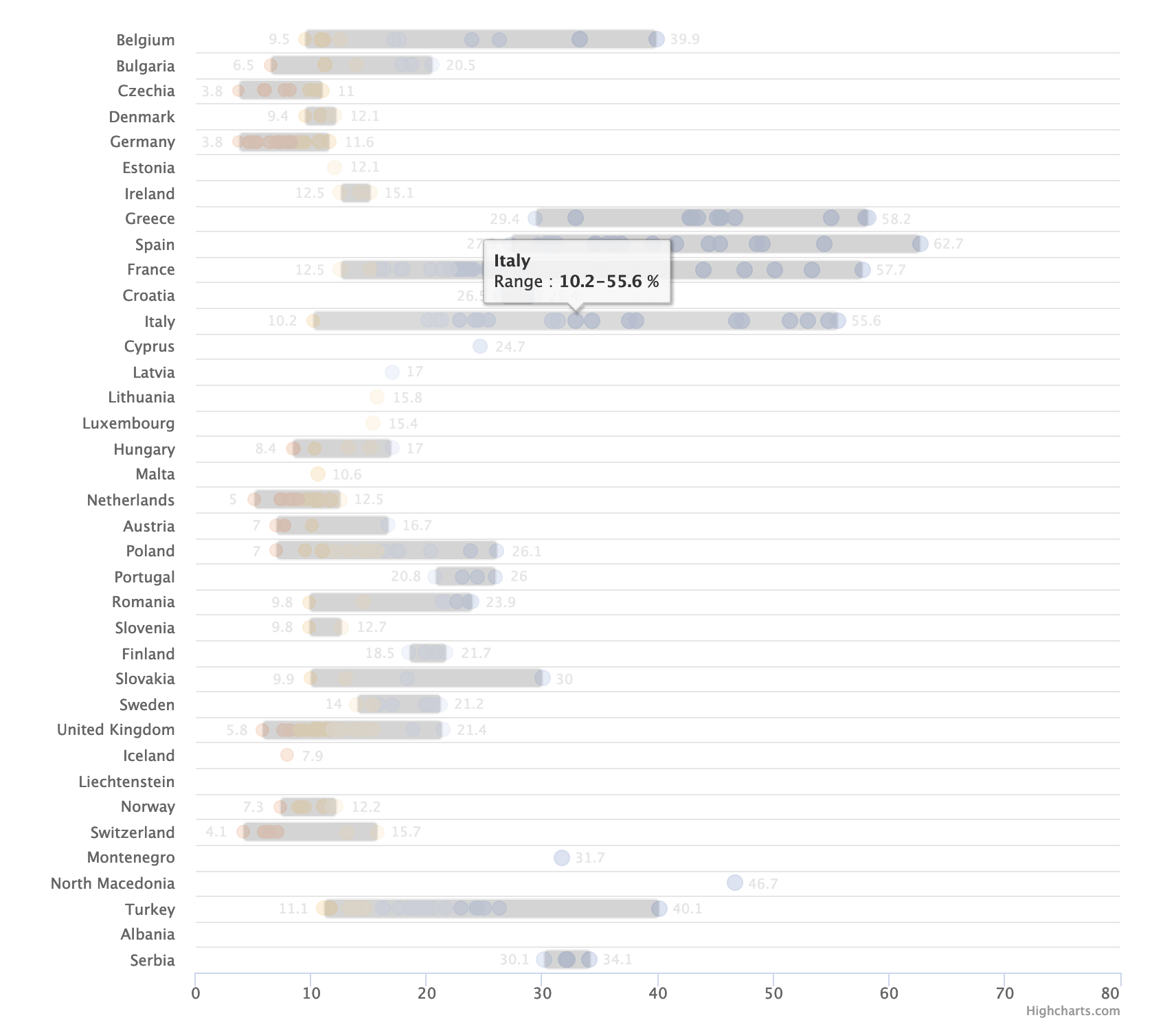
Range bar view
The full interactive output can be seen here.
Thank you for reading, feel free to leave any feedback in the comments!
Tags: data visualisation, datavis, SWDchallenge


