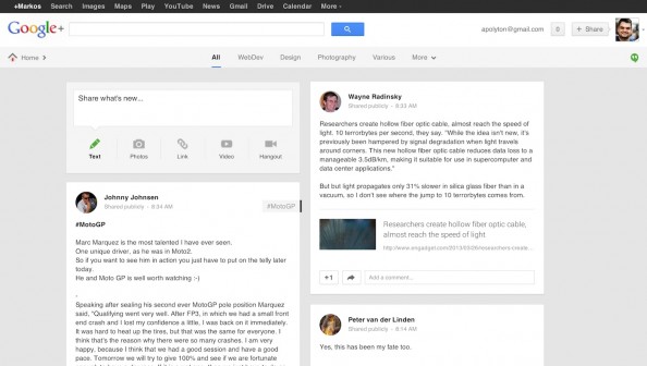
// Well, “fix” is a relative term. You might like the new look and feel of Google+ so you can stop reading now. But while I’ve initially loved it, I have been mounting up some serious problems with it. So much, that while I’m not a big fan of the various solutions to customise the CSS code of various sites (they can brake at any minute and then you have to work it out again), I had to do it this time.
So here are my problems with G+ and below I share the link to the “recipe” to fix them:
1) The Roboto font: it’s not rendering very well on Windows (Linus Torvalds had a great rant about it) but since I’m on retina Mac the main problem is that in general it is less legible (for me) and in a smaller size than the previous font. So I’ve switched to Helvetica (Arial in Windows) and increased the font size.
2) Showing the full text of posts and comments: It’s almost crazy. Depending on whether you have a photo, video or a link, you get 3-5 lines of text before Google+ shows a “read more” link. The stream has become a sea of images. I could go to Pinterest for that, I’m on G+ for what people *write*! So I now have full texts of posts and comments without the “read more” links. Even super-long posts will show up fully, which is not ideal, but far better than the default option.
3) Hiding animated GIFs: I used to think it was nice that G+ had animated GIFs support and Facebook didn’t. Then more and more people kept posting them, and now G+ has an integrated feature that creates multi-MB animated GIF’s of your photos. Like Vine, but without actually using a video format for what is essentially a video with 6 frames. E.g. no control of whether this will load, play or stop at any point of time. So I’ve applied a 5% opacity to all GIF’s. I could hide all together but I wanted to see who’s posting these monsters.
4) Wider columns: I like the 2-column layout but find the 450-pixel width a bit small and on my MBP I have the space to have them wider. So, a small change there too.
Now, all this is possible by the lovely Stylish extension for Firefox and Chrome, available at userstyles.org). Just download the extension and then you can install the “recipe” with one click from this page. You can then edit the code to remove any change you do not like. Stylish removes the comments when you add the style in your browser, here is the full code below.
Known issues: you might find that the “read more” links are not always removed from all posts and a couple of things have a larger font size that what you might like (like the +1 link on comments). Also, the stream might contain a few empty spots here and there. And of course, this might break at any time and stop working.
All this was made possible based on code by tvierling (font change) and Amber Yust (columns widths). Thanks also to Nico Gerrits and Stefan Münz for sharing related posts on the subject.
Tags: Google Plus


