Discovery of the day, filed under “Most Probably People Know About This For Years Now”.
One of the first parts of any design project is settling down on the fonts that will be used. Usually this comes down to selecting a font for headlines and one for body text. Choosing a third font is for people who really know what they’re doing.
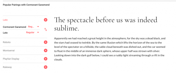
For web projects, Google Fonts is free resource of a quite big catalog of typefaces. The interface though doesn’t really help you pair fonts. When viewing a specific which also has a font-pairing feature but only for 4-5 predetermined (“popular”) combinations.
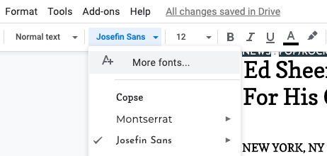
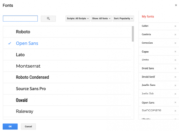
Phasing this problem, I skipped the part of googling “font pairing tool” and thought typefaces from Google Fonts would logically be part of Google Docs. Turns out they are, just hidden under a “More fonts” option in the font selector. 
 So there are other tools for this (see links below), but Google Docs did work nicely for me as a tool to test pairings of typefaces. It comes with a number of document templates to quickly give you a testing space all main typography-based elements (titles, headings, body text). You can use the Styles feature to save the font/size settings and apply it elsewhere. To test different pairs, you can easily create a copy of the document, select another font and compare the two documents side-by-side.
In any case, this is Cormorant Garamond combined with Josefin Sans. What do you think?
Other tools:
– Fontjoy – Generate font combinations with deep learning
– FontPair (catalog of real life font pairs)
Further reading:
– Choosing Text Typefaces for the Web (fonts.com)
– Serif v. Sans for Text (fonts.com)
– 6 tips for perfect font pairing (Creative Bloq)
– List of 30 Font Pairings (Canva)


