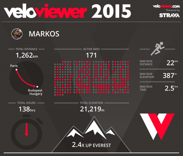
If you’re a Strava user, VeloViewer will create a visual overview of your running and/or cycling.
VeloViewer seems like an interesting service:
VeloViewer Tour Notes (Restricted to 25 activities for free users. Upgrade to PRO to see your entire Strava history.)
Your Activities page provides a fully filterable and sortable list of everything you’ve uploaded to Strava. Filter your data by as many columns, simultaneously, as you wish to find out exactly what you want to know. Hover your mouse over any column header to get aggregated stats for the currently filtered activities.
Turn on the “Map” view to see where you’ve been or more importantly, where you haven’t! Turn on the “Filter” option below the map to filter the list by the map’s current region. Clicking on an activity in the list will zoom the map to that activity.
Turn on the “Chart” view and try out endless configurations of graphs to further analyse your data.
Before moving onto another tab it is worth clicking on the name of one of your activities to view the very in-depth Activity Details page and then come back here and move onto your “Segments” to see that all-important list of up-to-date segment placings.
If your a stats geek, the PRO service costs 10£ per year. I’m tempted :)
Also published on Medium.
Tags: fitness, infographic, quantified self, Strava, tips, webapp, yearinreview


