HOME / Posts Tagged: data visualisation
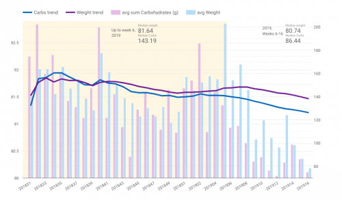
SWDchallenge: A low carb story
The theme of this month’s Storytelling with Data challenge is “artisanal data“. E.g. data collected personally by each participant, then analysed and visualised in a meaningful manner. I collect quite a lot of data on a daily basis tracking habits and activities. For my submission I used weight and nutrition data stored in MyFitnessPal. Particularly [Continue reading]
Emulating bubbles and shadows
Storytelling with Data is a popular data visualisation blog by Cole Nussbaumer Knaflic. Every month Cole sets up a challenge for her readers. This month, the theme is “Emulate!”, inspired by the book Steal Like An Artist: 10 Things No One Told You About Being Creative by Austin Kleon. The idea is to recreate a [Continue reading]
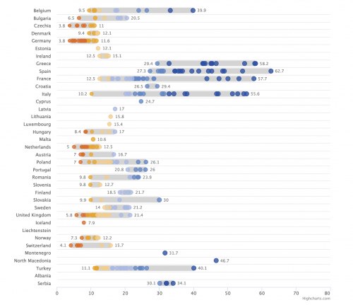
Choose your colours and thresholds wisely
When creating a visualisation of data, the colour choices and classes that your assigned too can change the message you’re trying to present. In a world of fast moving readers and quick social media sharing, all that can be left from your data analysis will be a visualisation that might give the wrong message. Read [Continue reading]
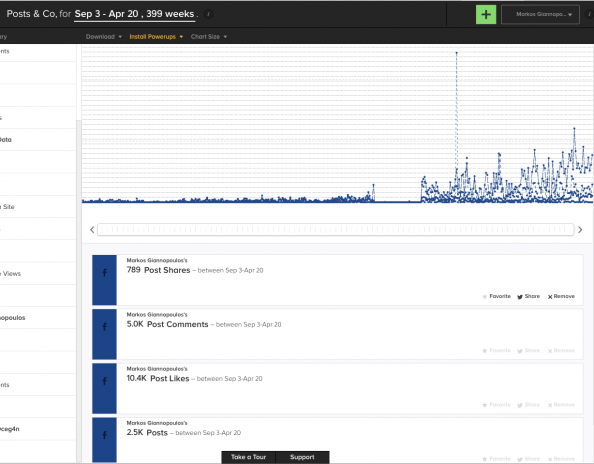
Seven years of Facebook in a single chart
I’m not sure I have seen any other service offer anything like that. In the screenshot you see what @SumAll has produced from my Facebook activity since the beginning of my registration, back in 2007, with numbers of posts, shares, comments per week. (I’m not sure what happened in 2012, I don’t remember not using [Continue reading]
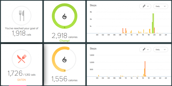
Quantified self, Level 2
Good friend Dimitris Dimitriadis (@insideabox) was writing about his use of self-tracking apps. I would like to explore this a bit further, in an effort to provide more insight on the purpose of the quantified self excerice. While any kind of tracking will almost instantly change the monitored behaviour (even subconsciously), it can be more [Continue reading]
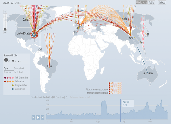
Data visualisation porn
The Digital Attack Map is a live data visualization, built through a collaboration between Arbor Networks and Google Ideas, that maps “distributed denial of service” (DDoS attacks) designed to take down websites around the globe. Many websites face targeted digital attacks by people who aim to silence their speech. This tool and visualization specifically surfaces [Continue reading]